

Cuz most modern UIs are actually web uis in disguise, and it’s easier to modify a standard progress bar than to make a new one.
Pretty sure this is in reference to health bars in games
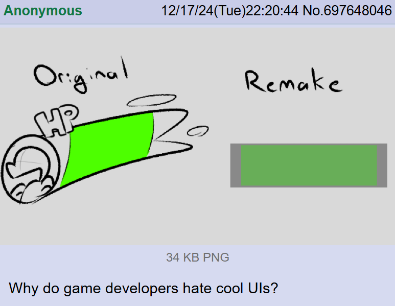
What is a health bar if not a progress bar for your death?
It’s because studios have UX designers nowadays. Which they didn’t had 15 years ago. Some UX designers optimize the game to the dumbest play testers, or they can’t read between the lines of the play test results. Play testers say they don’t understand the UI and the UX developer interprets as UI needs to be simpler.
In Mario & Luigi Superstar Saga, there’s a period of time between when you get your hammers and when you learn how to make small Mario/bury Luigi that the brother in back can swing their hammer and because you don’t know that move yet causes an angry Mario/Luigi animation to play like a “WTF BRO”
Those bastards removed it in the 3DS remake and I was so very disappointed when I found out, it was literally the first thing I tried after getting the hammers in the remake
It was such a small detail, but infinitely enjoyable as a kid, removed for nothing:(
They don’t.
They are under so much pressure to have scrum meetings that they have to sacrifice development time in order for the scrum master to keep his meeting KPI on target.
meeting KPI
Middle manager #4 needs to justify their existence to middle manager #5
What even is this? There’s no such thing as meeting KPIs in any agile framework.
And Scrum does allow for long meeting in case of extreme situations but any self respecting team will not take more than 10% of their total time out of a sprint for this.
What even is this?
Sarcasm. But I have seen some stupid shit similar to this.
My mistake then. It flew completely over my head.
All good mate.
Blame Material UI, the most fucking boring design timeline.
I’d say that Microsoft’s Fluent design language is even worse. Material at least tries to use rounded shapes and animations; Fluent has been pretending that monocolored rectangles are interesting since 2010. And it has been consistently wrong.
They need to bring back aero
To this day all five Windows machines in my house are running w10 with OpenShell and all of them use Aero themes. Any machine I set up for someone gets the same treatment. I’ve never had a complaint.
I still think material design 1 (which came out in 2014) is good, which focused on clarity with limited space. The problem started with material design 2 in 2018, which pushed for increased whitespace and homogeny in design. (And Microsoft’s Metro… shudder)
Material design 1 balanced clean and readable while maintaining depth (trying to emulate 3d space by “stacking cards of content” with shadows). But since most of MD1 was guidelines instead of, like, actual components developers could use, it was a double edged sword of forcing people to be a little creative in making their own UIs but cumbersome because you had to make it all yourself
Material design 2 tried to “fix” this by making everything simpler and shipping a ton of premade components that developers could just slap together and call it a day. Good for speeding up development, unfortunate because everything now looks the same. It’s also because of this that material design started to “break containment” and appear all over desktop applications/websites. It’s never good when a mobile design language is applied to the larger desktop space
That’s why I really don’t mind seeing material design 1 on either mobile or desktop, because it was designed to use space efficiently and interestingly. Material design 2 on the other hand favors whitespace and speed to the detriment of us all


