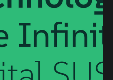

So what I see there is that badly designed fonts require ligatures to correct interactions.
Like, I get that there are some neat ones, e.g. I have them turned on when writing code for symbols, but they seem wholly unnecessary and distracting in alphabetical characters.
But I’m also the kind of weirdo that thinks the world needs more monospace fonts.
/shrug


You can do gui apps too! I used distrobox to run WebEx on an Ubuntu image for an interview. Just had to get to the actual binary to launch and it worked seamlessly.