

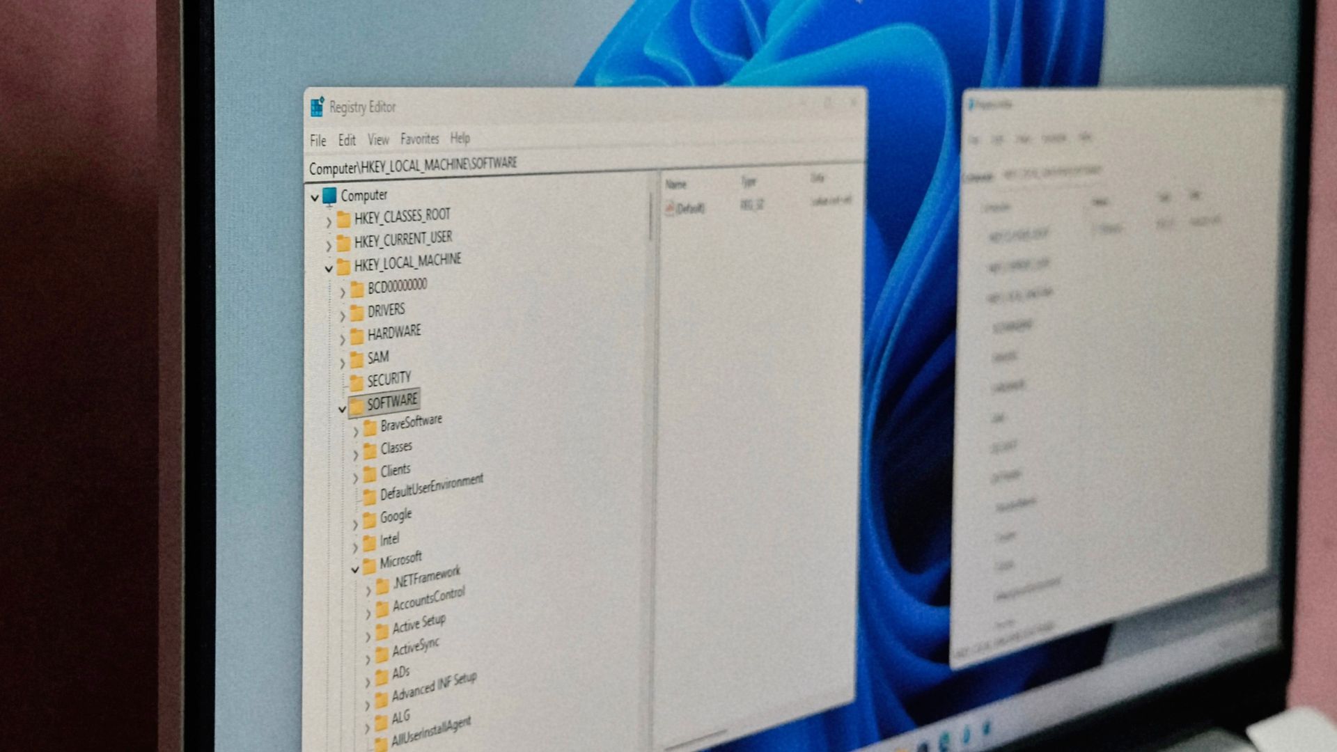
What improvements does this have over the existing app? The UI looks worse because I can’t see nearly as much at once. And that seems to be the biggest difference. Is it faster, especially when searching?
Same speed, apparently. It’s an alpha in the better case, so this is not represensative to the public version. Another possible future is MS never release it. We can’t know.
I’d even say it’s even worse, because it’s missing all the colors that the old one had. Now it’s more difficult to distinguish between different types of data.
I’m looking forward to being forced to re-adapt to yet another vibe coded and totally needless UI for no reason.
They’ve been fucking up UI long before vibe coding was a thing.
Oh, absolutely. They’ve been pioneers in the needlessly-redesigning-every-UI-just-to-add-one-more-pointless-click-to-everyone’s-workflow department.
Web technologies also multiplied their effectiveness at making UIs consistently worse (Teams is the perfect example, but all their Azure AD and Entra dashboards are hell on earth to use and navigate, too).
I love needing 5 clicks and 3 screens just to find my local IP /s
Accessibility is nice for users like me. If it supports dark mode, the larger text means I can read it much easier. I struggle with the olde stuff that is forced to be tiny on my monitor and doesn’t understand dark mode.
Windows 11 reg edit always looked like win 95


