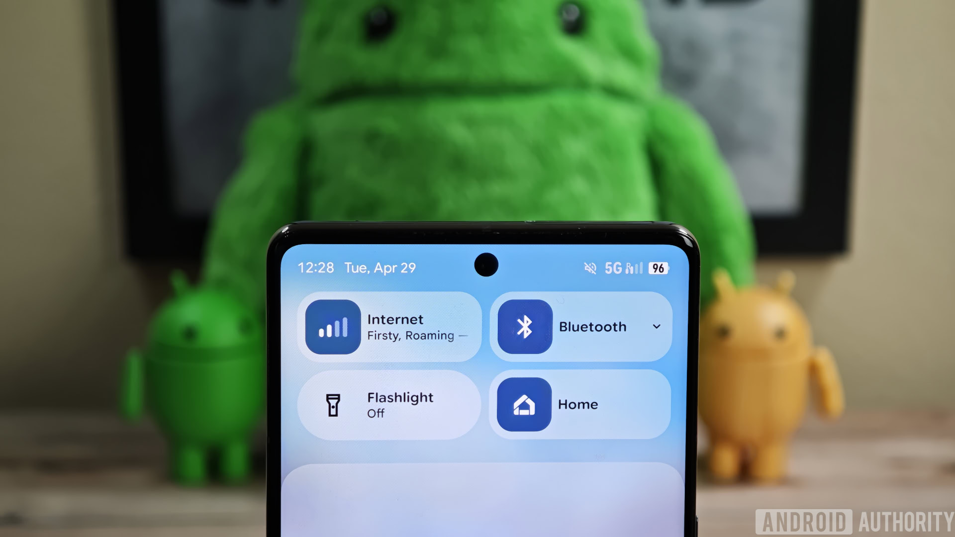
With every update, less information fits on the screen. The toggles got even bigger again this time. I just want to have 8 toggles in my pull down menu again :/
This looks cheap too. I hate huge margin zoomed in UIs
Just one more settings redesign man. I promise, just one more. Just one more design, I swear.
Its ugly
What the fuck. Is that the new UI? Blur everywhere. Looks like xiaomi knock off.
Yeah, I hate blurs on UI, subtle here and there is fine but this comes at the expense of contrast.
Google till this day has a lot of their apps display stuff and buttons inconsistently.
I am sure the new UI update will bring those back across different screens.
I remember when they introduced material design and people kept pointing out where Google didn’t respect their own guidelines
Very oneUI of them.
I buy an Android phone because the IOS Ui is fucking trash and takes years to display what I want it to display, not because I want it ro be as shitty as Android
These are such minor changes. The first two videos merely change the animation curve - that’s the animation equivalent of changing the colour of a button.