You must log in or register to comment.
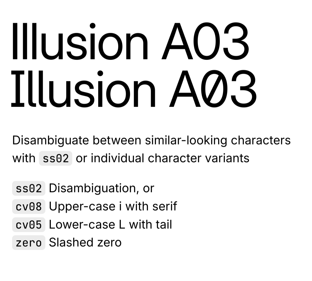
Capital i is same as non-capital L… So a horrible font for me.
Yeah that’s really frustrating
I guess they’re copying mainstream OSes (at least Android) with this one
Why do they do this?
The Inter typeface is very versatile and has many different options and variants, including more distinguishable uppercase i and lowercase L. The article just installed the base version as an example. https://rsms.me/inter/

TL;DR they switch to “Inter”
Not even that: merely looking to switch to Inter.
honestly I don’t see why they put effort into making a new font. there are plenty of freely available ones that are good enough


