Number of up, number of down, and total score next to the heart, that’s the perfect way to display that, well done.
Thx! This setting got added to the back-end, so other UI’s can benefit from it too.
Screenshot for those testing other clients?
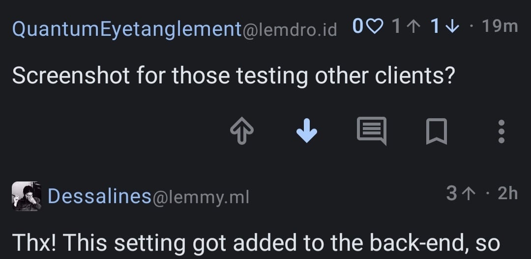
I had to downvote you to get the “total” (heart) to show up. You can see in the comment below yours that if there are only all up- or downvotes, it just shows that.
Indeed! It was the reason I had switched to thunder few months ago, but now jerboa is good as well. Keep it up!
Personally it’s a bit much, likes and dislikes OR the total score is fine
Having all 3 is honestly unnecessary and clutters up the UI
I don’t like the new style because the numbers are way too small and even changing the font size doesn’t help. You must have 100% vision to see them
~its 2024 grampa~
Sure but fyi in 2024 you can be considered a criminal for laughing at people with bad vision.
I just wanted to do subscript markdown, I didnt know what else to write
^I just wanted to do superscript markdown, I didnt know what else to write^
Yeah totally agree, it looks great!!
I’m on jerboa and votes disappeared completely. What heart?
Update the app, they were gone for me before I updated
I found it, “show scores” is now a slider in settings? Idk why it was disabled but I see them now, thanks!
